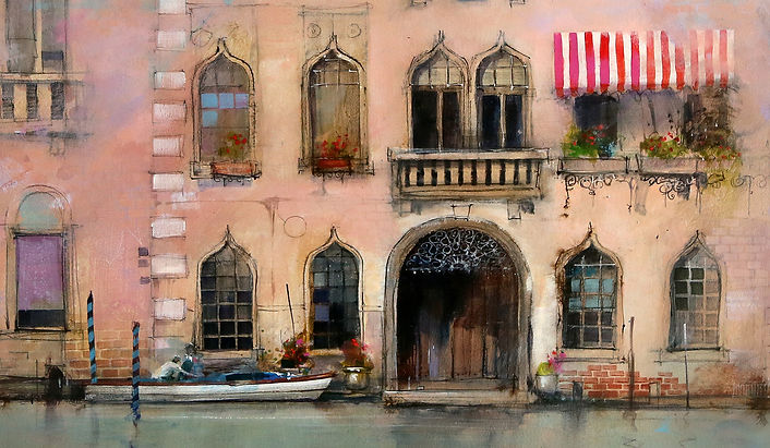
A decision that often causes confusion is how much information should be included in a painting? There is no hard and fast answer, but for me, too much information can create an uncomfortable confusion. I always like to balance areas of detail in a painting with contrasting areas of simplicity.
The viewer can become absorbed in the intricacy of the detail, but has the option to have their gaze wander out to areas of simplicity and relief. The contrast provided by the areas of understatement tend to amplify the apparent intricacy of the areas of detail.
Up Close and Far Away
A painting needs to attract attention from a distance. This is where color, tonal contrast and a strong composition do their work. Once attention is gained, the painting must continue to deliver interest. This is where our focal area with fine detail and information that only reveals it’s self under close inspection comes into play.

The complementary color contrast and strong tonal contrast around the focal point in this painting attract the viewers attention. As the viewer studies the painting in more detail, the intricate little details reveal themselves.

Old brick and stone walls, vegetable patches, a ladder and an old bicycle are not visible from a distance, but when viewed at close quarters, add a fascination and intricacy to the strength of the painting.

The soft ethereal atmosphere of this painting draws the eye down to the focal area around the main arch. Close inspection of the focal area reveals intricate ironwork, window details and areas of crumbling brick work.
As the eye wanders back out to the more understated areas there is still the hint of detail, but it is subtle and understated, relying on clues from the focal area to fully make sense of the suggestive marks.

Crumbling brick and stone, fancy iron lace-work, window boxes with potted geraniums, figures in a boat - small details that are only visible under close inspection.

This painting of some old apartment buildings in New York is a collection of intricate textures. There are areas of fine detail contrasting with areas of suggestion and simplicity. Buried in the areas of simplicity are tiny patches of detail, only visible at close range. This maintains interest and encourages more thorough inspection.

The focal area of the painting contains stronger color, more tonal contrast and a collection of complex textures.
Blurred ink lines, pastel pencil marks, areas of colored gouache and patches of gauze glued to the surface help build up the weathered patina of these old buildings.

Here we have another ancient, weathered building, this time in a little French village. The textured patina increases in complexity towards the focal area. As we move away from the focal area the definition of the building and tonal contrast decreases. This encourages the eye back to the focal area. There is still detail in the simpler areas but the reduction in tonal contrast make them less obvious, especially from a distance.

Variation in shape, size and color give interest to the stones and bricks. Watercolor, black and white charcoal lines, ink and gouache break up the surface to produce a complex, varied texture that echoes the weathered surface of the building.

This painting contrasts a large, simple area of sky and water with a focal area of the boats, jetty and buildings. Detail is concentrated around the fishing boat and main buildings. As the eye moves along the horizontal jetty to either side of the painting, detail decreases and definition becomes lost and suggested.

Tonal contrast and saturated colors give impact to the focal area. The contrasting warm colors also hold attention among the cool blues, greens and grays of the sky and foreground water.
Sometimes, particularly with a busy subject, there is a temptation to include too much detail. These examples show how concentrated detail around a focal area surrounded by regions of understatement hold attention, but allow the eye to wander out to areas of relief.
It is this contrast between areas of detail and areas of suggestion that makes the paintings interesting without becoming overwhelming.
Next time you are faced with a busy subject, do some sketches to shuffle around the idea of balancing areas of detail and relief. Try and have the painting work from a distance to grab attention, then under close inspection, reveal some interesting details.
Author: John Lovett
